


Sweepsouth has been an innovative player in South Africa’s domestic service industry for the past 10 years. Now the digital cleaning platform is refreshing its brand to reflect its distinct values and ambitions for the future.
”It’s been an 18 month journey to figure out how to stand out while staying true to our African roots,” says Lourandi Kriel, CEO of Sweepsouth. “We’re proud to unveil a new identity that speaks to the vibrant and bold personalities that bring joy to our customers’ lives on a daily basis.”
Along with welcoming more life and colour into their visual identity – Sweepsouth has expanded its service offering to include garden maintenance, car washing, heavy lifting, as well as pool and window cleaning.
Leaders within this home-grown brand feel that now it’s the perfect time to unveil a new logo, colours and visual identity to refresh its image.
-
Lessons for a decade in business
Sweepsouth cofounder, Aisha Pandor explains that when they started out, digital platforms in the domestic service industry were still a novel concept.
“Customers are now more tech savvy than ever before and their needs as well as expectations have grown over the years. We’re reinvigorating the brand to let them know that we’ll meet them where they are,” says Pandor.
Sweepsouth knows that the digital services landscape is much more competitive than it was 10 years ago. The brand has grown from strength to strength because it empowers customers through convenience and uplifts domestic workers by advocating for their rights.
“Sweepsouth’s model offers a range of convenient services while ensuring that SweepStars remain their own bosses, choose their schedules and preferred areas to work in. Empowerment stands at the core of what we do and it will always set us apart,” says Kriel.
-
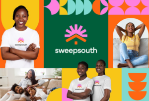
New colours and imagery bring a fresh sense of joy
By incorporating a new palette, striking photography and an updated logo, Sweepsouth has ventured to shape its new identity around connection.
“When you visit the platform you know right away that it’s a South African brand. One that’s deeply embedded in local culture and tied to the people who make it such an incredible country,” says Kriel.
The brand new logo features a house with the sun rising above it. The vibrant colours echo the familiar sense of joy you get from having a refreshed home. It also positions the home as the centre of our values and nods to South Africa’s diverse heritage when interwoven with the new brand patterns.
Where blue and white colours and minimalist fonts dominated the brand in the past, today it repositions itself with a variety of colours and shapes that symbolise unity and connection.
Circular graphics are incorporated to reflect sites of South African tradition like the rondavels that dot rural landscapes or the imbizo – where communities gather around a central point to share knowledge.
This use of circular shapes feeds into feelings of connectedness that Sweepsouth brings to communities.
Inspired by sunny days and sunsets as well as vibrant hibiscus, ocean and forest hues, a new range of colours embody Sweepsouth’s commitment to diversity and signal that this cleaning services’ platform is a source of happiness and positivity.
“The people who make Sweepsouth such a force for good – the SweepStars- are now at the centre of the brand’s image, acknowledging them as the heartbeat that keeps the platform growing,” says Kriel.
-
Taking a brand refresh to a whole new level
“We’ve always strived to be trustworthy, caring, and authentic, and the rebrand reinforces these values,” says Kriel. “Whether it’s through sparkling clean homes or the dignified work opportunities we provide, the refresh truly personifies the joy and positivity we bring to people’s lives through the work we do.”
This is a strategic repositioning because each element – from the updated colour palette, to the graphic elements and new iconography – tell a story about Sweepsouth and where it’s future.
Clear brand values, as well as a well understood growth trajectory are essential to making a refresh about more than just new colours and logos. “Taking the time to figure out the details of where we are going allowed us to act confidently and with intention while remaining true to our local roots,” advises Kriel.
For 10 years Sweepsouth has used technology to connect domestic workers directly to homeowners, transforming the housekeeping experience through convenience and accessibility.
Now the online platform is ready to usher in a new era, defined by the joys of human connection.
Sweepsouth brand refresh YouTube video