


An annual report is an excellent way to communicate your strategic vision and visually articulate your business’s story.
By following expert annual report design fundamentals, you can produce influential publications highlighting your organisation’s accomplishments and future ambitions.
With The Ethical Agency’s expert annual report design guidance, you can incorporate all the necessary features to create annual report designs that fascinate your readers.
An annual report: what is it?
A document that demonstrates an organisation’s previous year’s financial situation and operations. It uses comments, explanations, comprehensive financial statements, organisation information, successes, and challenges to paint a positive picture of the future.
Annual reports are usually structured to include:
- A statement from the chairperson or CEO
- An outline of the organisation’s approach
- An examination of the state of the market
- Highlights of organisational performance
- Current success highlights
- Details on social responsibility and corporate governance programs
- Predictions and forecasts
In short, an annual report helps stakeholders and other pertinent parties make well-informed decisions and investments.
*In most countries, annual reports are mandatory for public organisations*
The importance of design for your annual report
Many view annual reports containing financials, statistics, and other boring facts as compliance paperwork. However, an annual report is an excellent opportunity to tell your organisation’s story through engaging imagery, build awareness, showcase accomplishments, disseminate information, and explain your strategic direction.
This is the rationale behind the significance of your annual report’s design:
- Firstly, appearances count. Visually appealing reports draw readers in; well-designed annual reports are more likely to be read. In today’s data-overloaded environment, we have a limited window of time to engage readers and even less time to prevent distractions.
- Secondly, your annual report presents a chance to strengthen brand identification and differentiate your organisation from rivals. An annual report is a document available to the public and should visually represent your brand’s mission, values, and personality. There is also a marketing component to annual reports because potential investors will read your report.
- Thirdly, your annual report design facilitates effective information communication. Persuasive design draws readers in and increases their comprehension and recall.
- Lastly, a well-designed annual report breaks complex information into easily understood visual sections and infographics.
There is more to an annual report’s design than meets the eye.
Understand your target audience
Excellent design fulfils the demands of its audience. When creating your annual report, consider your audience. Who will read it? Employees, clients, customers, or shareholders? Every group has distinct tastes and expectations. It’s critical to modify your design to satisfy these requirements.
An interactive annual report, for instance, would be ideal for a younger, tech-savvy audience. However, if your target market is more interested in printed materials, a more conventional design could be preferable. When selecting design features, consider age, ability, interests, and reading preferences.
Remember: the information you provide in your annual report will be more effective if its design is tailored to your audience’s tastes.
Design as a means of storytelling
Effective annual reports demonstrate rather than tell; compelling imagery is the foundation of visual storytelling. A powerful visual narrative fuses the broad overview of your annual report with in-depth analysis to take readers on a tour of your organisation’s year-long journey.
Take a look at The Ethical Agency’s 2022 Annual Report for The National Business Initiative (NBI). Using engaging imagery, they effortlessly integrated brand storytelling; each segment builds on the one before, articulating mini stories with text and pictures.
Understand that every design decision, from images to layout, affects how readers interact with your annual report. Focus on a well-thought-out design that guides readers through each section with ease.
Remember:
- A good story has chapters that weave narratives with a distinct beginning, middle, and end, including character, setting, conflict, plot, and theme.
- A traditional story has complexities, a crisis, a climax, a resolution, or a problem and a solution.
- Emotions, communities, and individuals are all involved in good storytelling.
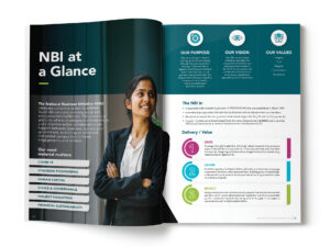
| Alt text | The Ethical Agency Annual Report Design — National Business Initiative (NBI) |
| On-Page caption | Annual report design — National Business Initiative (NBI) |
| File location | https://drive.google.com/drive/folders/17A8vFYSSrWqqBzKrhMZjpHcU-vq4h4oJ |
| File name | NBI Annual Report – Design mockup1.jpg |
Employ a visual design hierarchy
The effective arrangement of design elements to direct attention is known as visual hierarchy. Even if readers are just skimming your report’s content, it helps to contrast important information in your annual report.
Another important factor is colour; intense hues draw attention to important information, while softer hues make text or graphs stand out.
Typography is essential. Different typefaces and text sizes alter the feel and flow of information. Smaller fonts are better suited for body material and supporting details, whereas larger fonts are better for headers and major ideas statements.
Varying font styles create contrast and room. Proper spacing creates a roomy, serene, and comfortable reading experience by quickly guiding readers through your report and separating sections.
Each of these is a component of visual hierarchy. When used effectively, visual hierarchy guarantees that your main points are conveyed effectively.
Put readability first
A properly designed annual report should be easy to read. Always aim to make your copy direct and easy to understand.
Here are a few helpful guidelines:
Start with readable, clear fonts. For main body copy, use point sizes between 9 and 12. Headings, however, should be noticeably bolder and larger.
Provide adequate room. Use clear headings, ample margins, and space. This will facilitate comprehension by providing visual breaks for readers. Avoid packing too much information into too few pages.
Aim for a neat layout. Clear layout and design aid in drawing readers’ attention to your material. Leave some space; it will balance your arrangement and lessen distractions.
A picture speaks a thousand words; imagery and photography should be utilised to break up text. The more visuals you employ, the less information will feel like walls of text.
Always strike the ideal balance between readability and attractiveness; your readers will appreciate it!
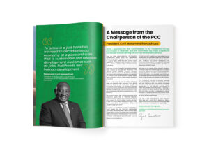
| Alt text | The Ethical Agency Annual Report Design — Presidential Climate Commission (PCC) |
| On-Page caption | Annual report design — Presidential Climate Commission (PCC) |
| File location | https://drive.google.com/drive/folders/17A8vFYSSrWqqBzKrhMZjpHcU-vq4h4oJ |
| File name | Presidential Climate Commission Annual Report Design Spread 1.jpg |
Include visual aids and infographics
Infographics and visualisation are among the most powerful methods of presenting data in an annual report. Malcolm Gladwell famously said, “The key to good decision-making is not knowledge. It is understanding.”
This is precisely what infographics and data visualisations offer, turning complex information into understandable images that enhance comprehension and memory.
Here are a few helpful pointers:
- Simplicity: Stay focused and straightforward with your design. An overly complex infographic or visual aid may divert readers and be counterproductive. Use simple designs that focus on one idea at a time.
- Use the correct chart types: Different charts are needed for different kinds of data. For instance, a pie chart can show proportions, whilst a bar graph may be better for comparing data. Select the type of chart that best illustrates the information you are sharing.
- Try to tell a story. Infographics and other visual aids help to support your main point. Make sure the visual aids complement the overall narrative of your report.
- Think about scale and size: Make sure graphics match content. Misleading scales can result in inaccuracies and distorted data displays.
- Use essential data and phrases from your material: Infographics and larger typography can be used to highlight important messages in your content.
- Annotations are beneficial: Text should only be used sparingly to provide context or highlight important details.
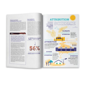
| Alt text | The Ethical Agency Publication Design Centre for Environmental Rights |
| On-Page caption | Publication design — Centre for Environmental Rights (CER) |
| File location | https://drive.google.com/drive/foalders/17A8vFYSSrWqqBzKrhMZjpHcU-vq4h4oJ |
| File name | CER — Polluter Pays Publication Design.jpg |
When creating your annual report, consider digital mediums
In the digital age, interactive components may be necessary to keep busy readers interested and increase reader investment in your annual report.
To create various interactive experiences, you can incorporate interactive charts, embedded films, and clickable links that take readers to different sections of your website or annual report.
This is why making a shorter annual report with links to specific pages on your website is an effective approach for readers who want the most recent information.
Here are a few simple steps to follow:
- Determine opportunities. Choose which section of your yearly report would benefit from an interactive element. It could be a lengthy section accessed through anchor links, a case study presented through a video, or an intricate infographic simplified with hover effects.
- Produce high-calibre material: Adding interactive elements alone is not enough; your content must be appealing. Make sure that any videos, graphics, and other connected information add value, improve understanding, and support the primary goal of your report.
- Test: Conduct a dry run before publication to ensure interactive elements function correctly across various devices. You would want to avoid malfunctioning features irritating or alienating your audience.
*Your annual report must be exported as a PDF for interactive features to function*
Interactivity as a design feature can improve the reader experience of your annual report. This will keep your report current by bridging the gap between immersive experiences and traditional reporting.
Create eye-catching report covers
Initial impressions count—your cover design is where it all starts.
Focus on creating covers with strong visual components, imaginative conceptual design, and a unique aesthetic characteristic that embodies your brand voice. Covers should set the mood and prepare readers for the content ahead.
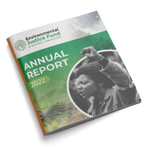
| Alt text | The Ethical Agency Annual Report Cover Design Example 1 Environmental Justice Fund |
| On-Page caption | Annual report cover example – The Environmental Justice Fund |
| File location | https://drive.google.com/drive/folders/17A8vFYSSrWqqBzKrhMZjpHcU-vq4h4oJ |
| File name | EJF Annual report design.jpg |
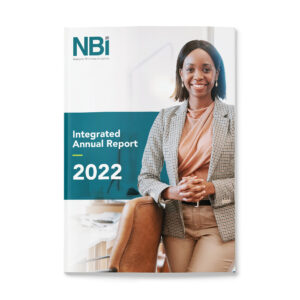
| Alt text | The Ethical Agency Annual Report Cover Design Example 2 The National Business Initiative (NBI) |
| On-Page caption | Annual report cover example – The National Business Initiative (NBI) |
| File location | https://drive.google.com/drive/folders/17A8vFYSSrWqqBzKrhMZjpHcU-vq4h4oJ |
| File name | NBI Annual Report – Design cover design.jpg |
In conclusion
We hope this guide clarifies the importance of thoughtful design when creating annual reports.
The primary takeaways are as follows:
- Design decisions should be made with your audience’s preferences in mind.
- Using visual storytelling to tell your brand’s story keeps your readers engaged.
- Visual hierarchy directs readers to core messages, further increasing comprehension and recall.
- Text and visual aids must be balanced for readability.
- Complex information should be simplified via infographics and visualisations.
- Videos and animations are examples of interactive components that increase engagement, turning static reports into dynamic experiences.
- Never undervalue the impact of a visually engaging cover.
Whether you design your next report or employ a professional annual report design partner, ensure it has personality and “life,” reflects your organisational identity, and connects with your audience.
For assistance with annual report design, contact The Ethical Agency.